the absolute in design, layout, technicality and the works!
Our entire thoughtfully-designed Responsive Web Design packages are created to offer our clients’
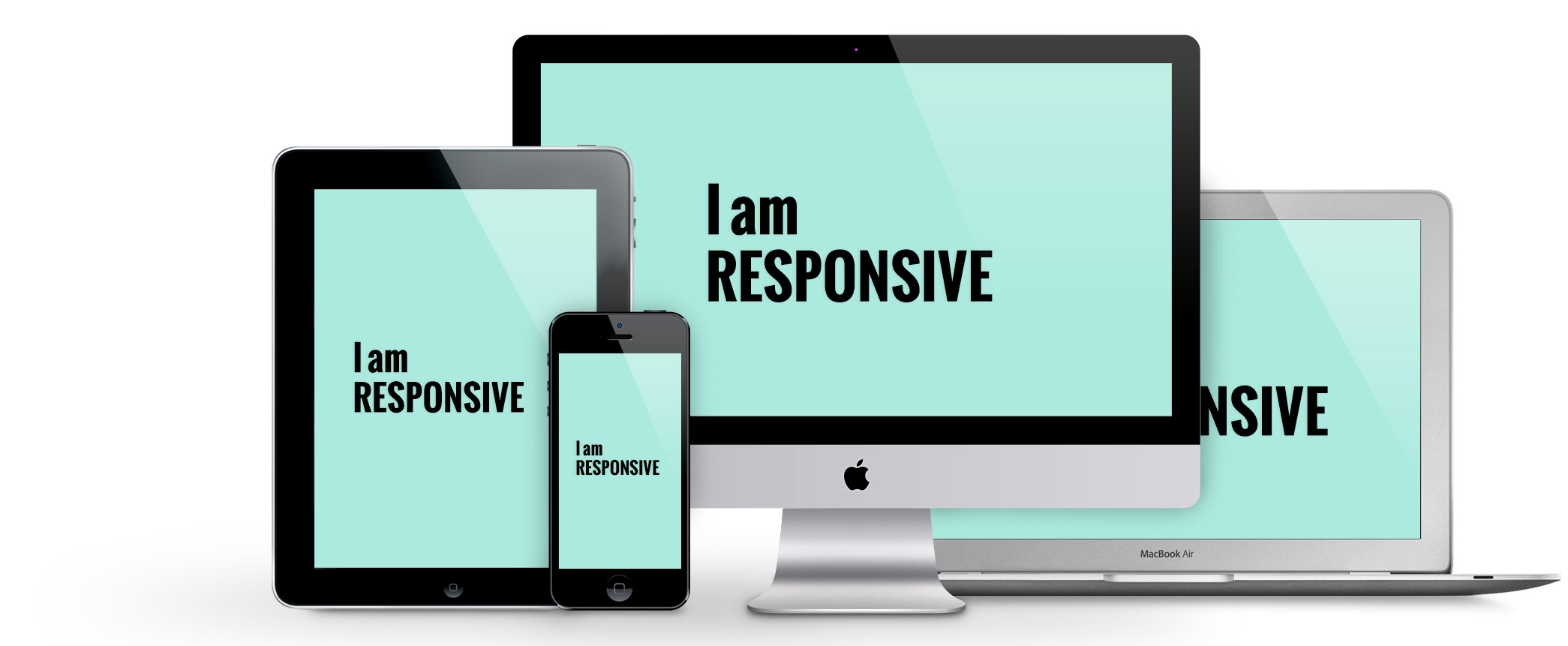
What are Responsive designed Websites?
With the advent of the smart phones and the increased usage of a range of devices like tablets, laptops, desktops, phablets, gaming consoles, smart phones and wearable devices. The websites have to be designed in a way that is compatible to all mediums. Also the respective website has to represent itself similarly in all devices and adapt itself without undergoing a change in its appearance, colour and general layout. Therefore, keeping these factors in mind, responsive web designing basically incorporates a focused shift on how to design and devise websites consistently. The representation of the content and the design has to be optimized uniformly for all devices.
Indian smartphone owners
- A whopping 92% of smartphone owners accessed the Internet via their smartphones daily.
- 60% of smartphone owners used Search engines on their smartphones daily.
- 54% of smartphone owners visited the website of a business after performing local search on their smartphones.
Responsive web design (RWD) is a web designing approach intended to build websites to provide a best possible viewing experience. This basically entails ease of use, readability, easy to navigate, scroll and employ other functionalities with minimal alteration to the original website structure and design, irrespective of the device.
It is said that responsive websites layout, in a way respond to their surroundings. The design in a way just responds to the requirements of the users’ and the gadgets or devices they are using. The websites designed in this platform are very adaptive with a range of fixed layouts within and on the other hand responsive with several fluid-grid layouts. So in a nutshell, the web design changes according to the resolution of the device.
The approach of a RWD or Responsive website design is that it adopts a designated fluid size for smaller websites and a fixed breadth for larger and medium-sized websites. The images used in this form of designing are referred to as context-ware. Therefore, these images will respond to different resolutions in accordance to the device used.
Responsive web designing is completely different from designing for the regular traditional static websites. This type of designing is quickly developing, rapidly gaining ground, increasingly getting popular and garnering quick acceptance across all mediums. In this form of designing, currently, there are some accepted design models that work well across any desktop or mobile device.
Responsive web design patterns are quickly evolving, RWD is definitely here to stay. This is soon going to be the norm in web designing as increasingly, owing to time, convenience, accessibility; people are surfing online on their Smartphones or other adaptable devices as compared to the traditional computers.
When ComX Technologies conducted an in-depth study into the Smartphone penetration into our lives, the statistics were mindboggling. The numbers revealed that most users’ regularly accessed internet regularly on their phones or related devices. Also most searchers used search engines for their surfing and many a time, after conducting a local search, they would seek the specific websites. This just revealed the increased use of mobile devices, its market penetration and acceptance across all age groups, genders and location.
The future in web designing is going to be Responsive.
Therefore, as a heads-up to all our clients’ and potential clients’ we would like to enlighten you about ‘going mobile’. If your website or any of your online web presence is not optimized to appear uniformly across all devices including phones and computers, then you may lose out. You may lose out on your existing clients’ or even fail to attract potential clients’ because your website is not appealing or eye-catching. And the reason as we had mentioned earlier is to do with incorporating responsive web designing. If your existing website doesn’t fit the norm, then it would be a good idea to revamp your website design. If you are a new business, then it is best to create the website as a responsive website as this is will prove to be a game changer with a keen eye on the future.
The advantages of adapting a Responsive Web design with us, ComX Technologies would be:
Licensed version: The software is bought and the merchant will own the licence and this can be hosted on any server and operated.
Open source service: Under this type, the software is free and comes with no cost. The store owner has to host it on any server and users can access and modify the code if they chose to.
Now you can have your custom-designed online store armed with the state-of the-art design and compatible features that will give you ‘THE ONLINE PRESENCE’ from Day One!
And all this and more when coupled with our state-of-the-art expertise, knowledge experienced personnel who specialise in Response Web Designing and as we have already tapped the market in this genre and have catered to numerous clients’, we are definitely worth considering!